
The importance of colour
 News and PR from Harfield Components Ltd - Published 30 March 2020
Various studies have shown that we have a great inclination to respond to colour. This means that choosing the right colour schemes, especially in the healthcare sector can be very important.
News and PR from Harfield Components Ltd - Published 30 March 2020
Various studies have shown that we have a great inclination to respond to colour. This means that choosing the right colour schemes, especially in the healthcare sector can be very important.Blue is one of the most popular colours used in the healthcare sector for many years due to its calming effects on patients. It is especially effective in resting and sleeping areas, but also waiting rooms, where patients tend to feel more nervous and anxious. According to ÂThe Application of Colour in Healthcare Settings released by The Centre for Health Design in 2012, Âcool colors may be appropriate in environments for agitated, hypertensive, or anxious individuals;Â. It is also widely associated with trust and stability. Same as blue, green  the colour symbolizing life, nature and harmony  can be advantageous for patients, who suffer from anxiety or have nervous tendencies as studies show that green colour reduces central nervous system activity.
Other colours showing to be very beneficial in the healthcare sector are red and yellow, which seems to be particularly successful among patients with Dementia and AlzheimerÂs. Based on ÂThe Application of Colour in Healthcare SettingsÂ, Âbright, strong colors stimulate and encourage activity and further studies show that the colour red can significantly increase brain wave activity. It is also used to stimulate the production of adrenaline in patients, improve the patients appetite as well as provide a good visual contrast for the patient. ÂRed and yellows, for example, may be used in settings where creative activity is desired and socialization encouraged; greens and blues in areas that require quiet and extended concentration and high visual acuity (Sharpe, 1974). Â
Recent trials at different healthcare institutions across the UK have shown positive effects of yellow on patients suffering from Dementia. The first initiative took place back in 2016 on the dementia ward at Furness General Hospital, in Barrow, where patients were served an additional 10 grams of food to their usual portions and the meals were plated on brightly coloured plates rather than plain alternatives. Dianne Smith, the matron for dementia at the University Hospitals of Morecambe Bay NHS Foundation Trust, mentioned speaking to the Daily Mail: ÂPeople with dementia often experience visual problems, including not being able to distinguish between different coloursÂ, but highly contrasting colours such as yellow on a white table provided great help to navigate between different objects.
To read more go to:
https://www.harfieldtableware.co.uk/blog/the-importance-of-colour/

 Certain colours have been shown to achieve positive results among patients with specific conditions such as dementia.

Other announcements from Harfield Components Ltd
-

The Power of a Nutritious Breakfast
The Power of a Nutritious Breakfast: Why Free Breakfast Clubs Matter for UK Children
18 Sep 2025
-

NEW - Harfield Premium Walled Range
The NEW Harfield Premium Walled Range where elegance meets durability.
22 Jan 2025
-

Harfield's Premium Collection - NEW 23cm Walled Plate
Introducing our NEW 23cm Walled Plate, part of Harfield's Premium Collection.
02 Oct 2024
-
Are you ready for the UK single-use plastic ban?
England is set to join Scotland, Northern Ireland, and Wales in taking a significant step towards environmental sustainability by implementing a single-use plastic ban starting on October 1, 2023.
12 Sep 2023
-

Our NEW 2023 Catalogue is here!
We are excited to share our new catalogue: The Collection 2023. Inside the catalogue you will find all the products that have established Harfield as the UKs number one manufacturer of tableware:
13 Feb 2023
-
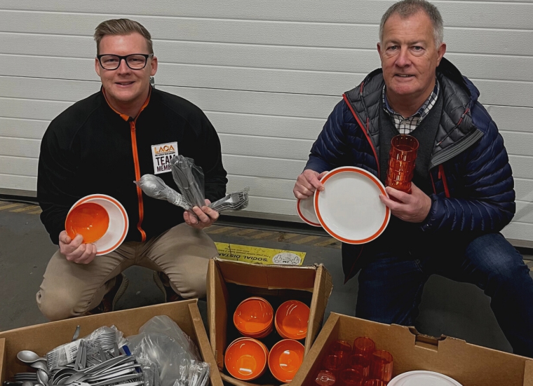
HARFIELD MAKE A DIFFERENCE
At the end of 2022, LACA held the Annual School Lunch event at the House of Commons, showcasing 'all that is great about school food'.
13 Feb 2023
-

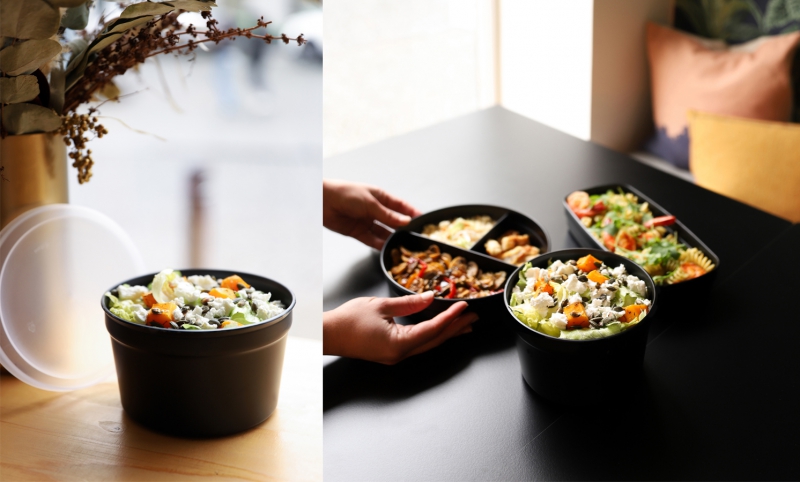
On the go with Harfield
Delivery and takeaway are now a popular option for many consumers. This means caterers are looking for new solutions for safe, cost effective and quick ways to provide meals to their customers.
10 Mar 2021
-
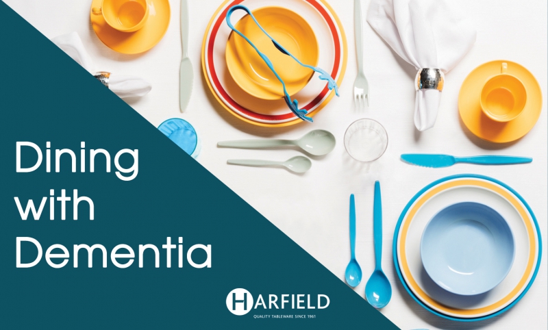
Dining with Dementia
We understand catering for each persons individual dining needs is important in dementia care, this will result in a better dining experience and ultimately encourage them to eat and drink more.
08 Jan 2021
-
Harfield Antibacterial Range How does it work?
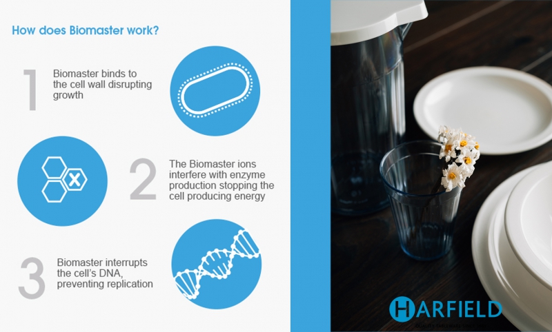
Weve been partnering with Biomaster for 8 years now to provide a comprehensive range of antibacterial products especially designed with the healthcare sector in mind.
26 Mar 2020